ICAP
Logo & Visual Identity
Based at Columbia University with operations in more than 40 countries, ICAP is a leader in global public health, internationally known for tackling the world’s toughest health challenges—from HIV to tuberculosis, from malaria to maternal and child health, and the growing problem of non-communicable diseases, and most recently, the COVID-19 pandemic. Through innovative research, collaborative technical assistance, and a focus on strengthening health systems, ICAP helps to create better and more accessible health services to reduce the burden of illness on people and communities.
As ICAP neared its 20th anniversary in 2023, the organization sought to more accurately reflect the scale and scope of its global impact. To achieve this goal, a new brand and visual identity was created and rolled out in partnership with communications strategist Colby Kelly.
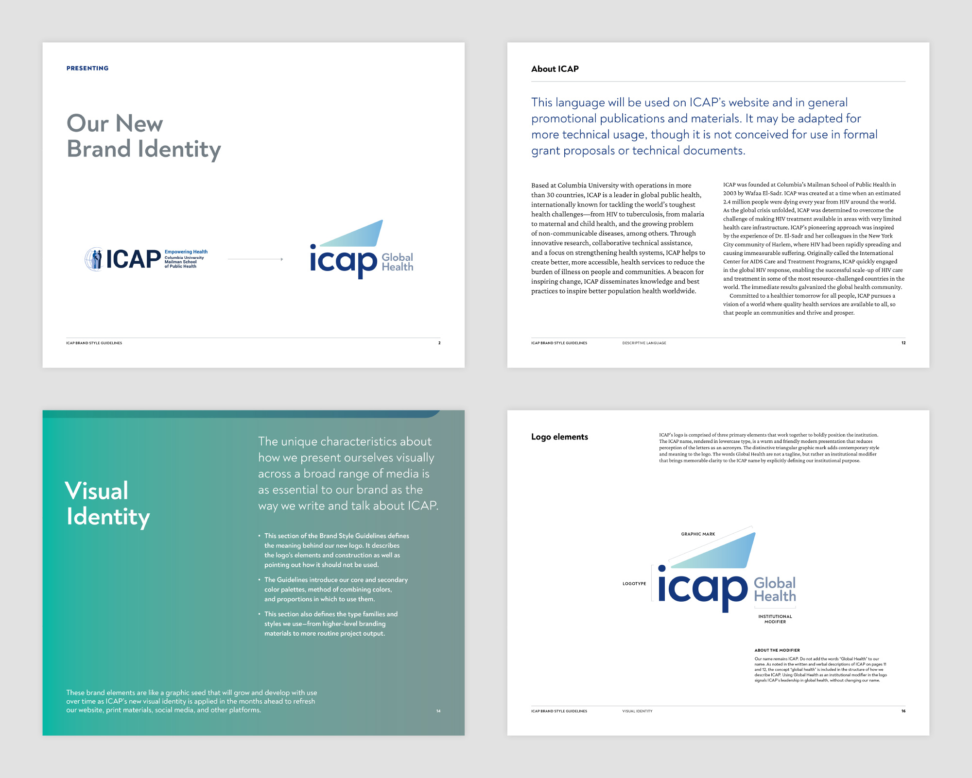
Originally called the International Center for AIDS Care and Treatment Programs—the name no longer fit as an acronym since ICAP had expanded well beyond HIV/AIDS into all aspects of public health around the world. Yet after months of formal research, surveys, and interviews, it was determined that the organization’s name ICAP carried with it too much history and brand equity to abandon. To remain with the name ICAP, but decouple it from the original acronym—a visual identity was proposed anchored on a logo set in all lowercase type.
With the inclusion of institutional modifier “Global Health,” the new identity is far more succinct. And pictorially, it depicts ICAP as a beacon that lights the way forward in the field of public health.


