Children's Health Fund
Identity Update, Logos, Editorial Design, Collateral, Ads
Singer-songwriter Paul Simon, pediatrician Irwin Redlener, and program designer Karen Redlener founded Children’s Health Fund (CHF) in 1987 after touring the Martinique Hotel, a homeless shelter for families in New York City, and witnessing the dire conditions under which children were living. Through its uniquely designed and fully equipped 36-foot long mobile medical clinic that included a registration area, vital signs station, and two examination rooms, CHF pioneered the use of mobile clinics to bring healthcare directly to the children and families with the least access. Understanding that the well-being of a child goes beyond a medical clinic, our focus also includes a robust history of supporting and advocating for public health programs that provide a critical safety net for medically underserved children and address systemic issues within America’s health infrastructure.
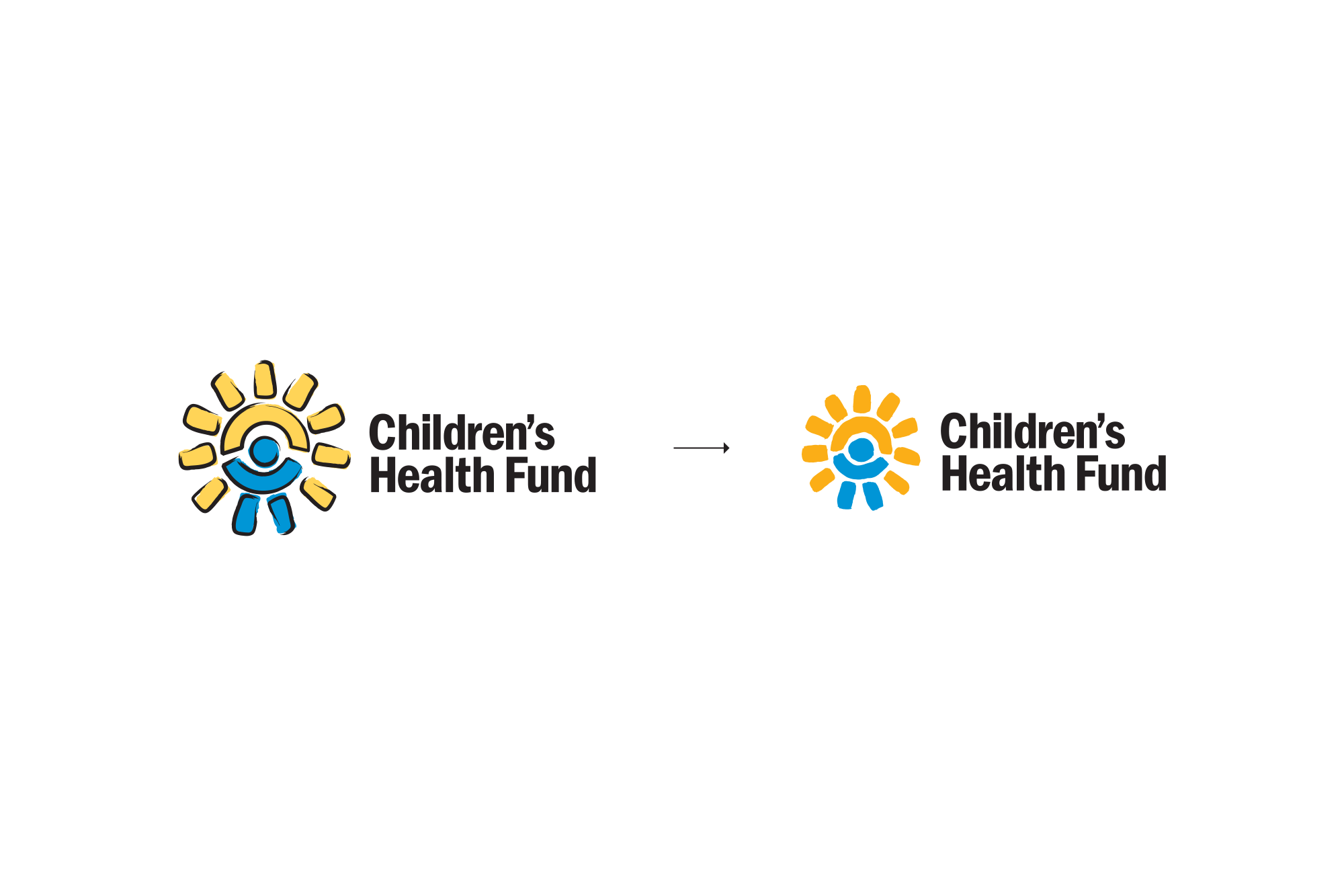
The CHF logo was updated and refreshed with a new drawing of its symbol. The original artwork was created using a “brushstroke effect” in vector software, resulting in an uncanny rendering that appears handmade but obviously is not. This was compounded by including stark black strokes on top of the underlying shapes. The new symbol art was executed with physical media, brush and ink, and then digitized. The warmer, natural variation of real brush strokes is unhindered by not having contour strokes, and a new, darker yellow ensures the color holds shape in both print and digital environments.
Stemming from the updated symbol art—a special 25th Anniversary logo was drawn and digitized. Additional campaign and project logos were later created, in combination with a playful and versatile humanist sans-serif.
The updated identity was applied across a variety of print and digital materials, such as the organization’s website, publications, brochures, and advertising.


